Training Jersey
The mission for this project was to design a training jersey for the Sydney Roosters NRLW organisation celebrating the rich cultural identities of the women who wear it honouring their roots, ancestors, and the communities they represent.
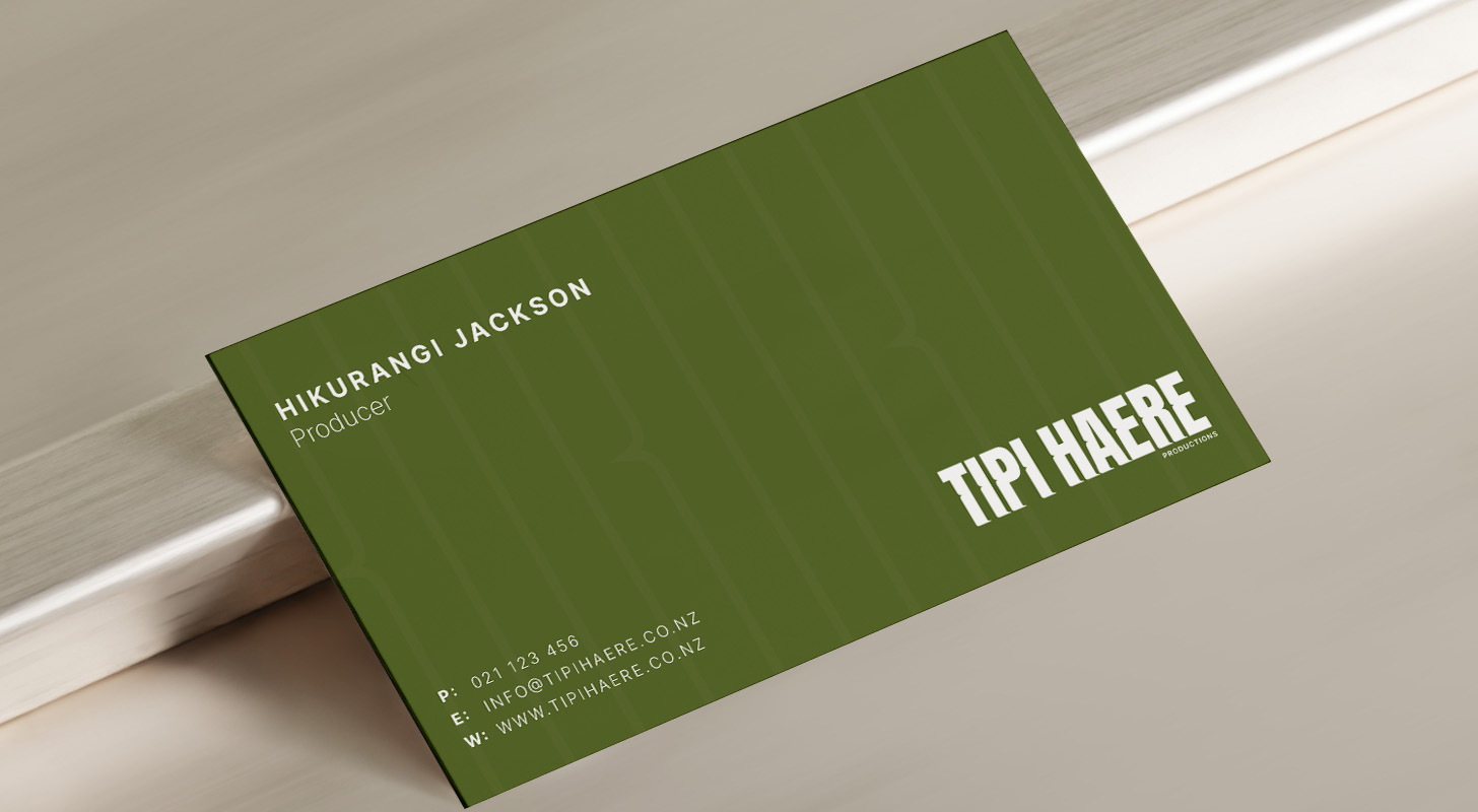
The outcome of the Logo designed and created was drawn from the discovery session. The colour green was a representation of nature, growth and harmony aligning with the company’s focus on the natural world and culture. The icon used as part of the Logo is a man with a Kete on his back which is a traditional Maori woven basket - going on a tipi haere referring to a journey.
The end results of the design visually represented the essence, look and feel of Tipi Haere productions from the use of font, colour, style and icon creating the vibe of deep cultural context.
Tipi Haere productions is a new, innovative media company that specialises in creating TV shows and diverse content with a mission of bringing authentic storytelling to life with a particular focus on Maori Perspectives.
Tipi Haere Productions not only focuses on being a media company but being a platform that amplifies Maori voices with Maori roots that inspire the company to honour the past while crafting content for the future, creating a space for authentic representation in the media industry.
Our discovery session allowed us to dive in deep and explore the ‘look and feel’ of Tipi Haere productions to create a logo and design that focuses on the colour, font and icon that best represents cultural richness, storytelling, empowerment and the essence of something that inspires to pave the way for the future ahead.
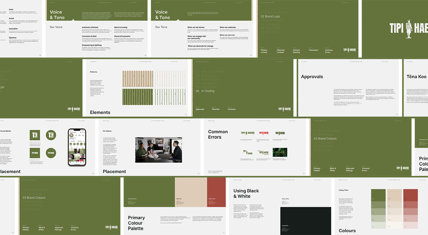
The final design that was chosen incorporated the look, feel and philosophical values of Tipi Haere Productions.
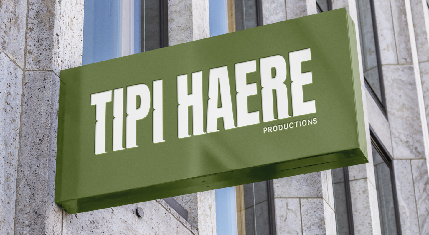
The words ‘Tipi Haere’ in clean easy to read font and instantly visible, It was really important make these words stand out strong and bold as it’s very significant to the overall production with a deep cultural meaning referring to the act of roaming or travelling often used to describe a journey of exploration and discovery which transpires to exploring untold stories, embracing creativity and sharing them with the world.
The colour green representing nature, growth, harmony which all align with the company’s focus on the natural world and culture reflecting a cultural connection and a grounded earthy presence. The back view icon of a Man with a Kete on his back going on a Tipi Haere (journey). The important cultural significance of the a man wearing a traditional Maori woven basket while on a journey represents the core significance of the company and it’s overall mission and purpose.
Training Jersey
The mission for this project was to design a training jersey for the Sydney Roosters NRLW organisation celebrating the rich cultural identities of the women who wear it honouring their roots, ancestors, and the communities they represent.
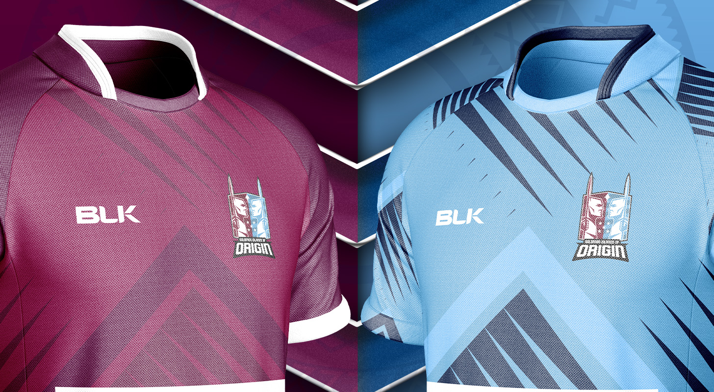
For the shield emblems created we carefully crafted two warrior silhouettes, one to represent the men and one to represent the women. For the men’s shield you see two warriors each holding traditional spears symbolising a fierce yet respectful battle that rugby league represents, united in spirit, strength and drive. For the women’s shield you see two warriors holding paddles symbolising a powerful life journey representing moving through challenges, adapting to tides and forging new paths rooted in pacific tradition as the paddles speak to the strength, resilience and unity of Solomon Islands women. "

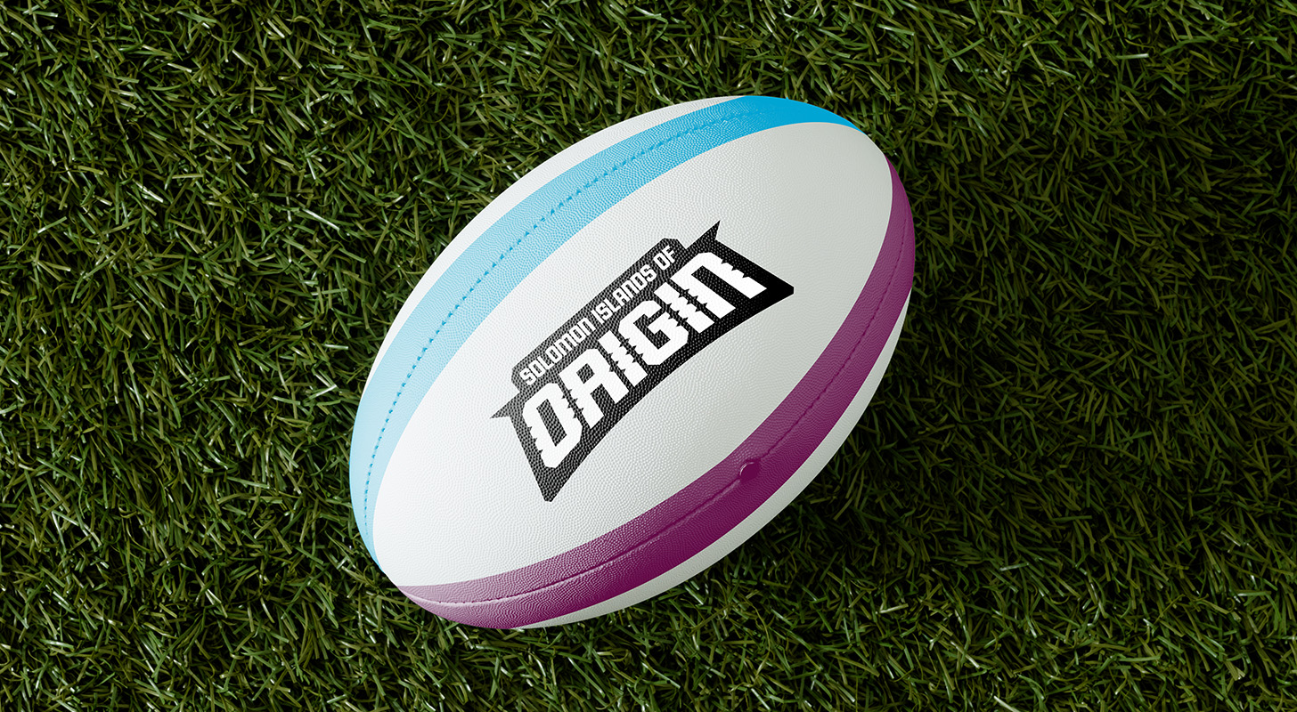
We were able to create something exciting to inspire rugby league in the Solomons drawing inspiration from the well known state of origin concept. We believe that these emblems created draw exposure, excitement and inspiration visually for developing pathways creating opportunities for people in the Solomon Islands starting with those in Honiara.

Solomon Islands of Origin is a grassroots rugby league initiative inspired by the State of Origin concept. As rugby league is still new in the Solomons, the idea of Maroons vs Blues is widely recognised and so it was important to build on the familiarity to create real pathways for young men and women to play, learn and grow through league.
With local leadership, community support and international partnerships, Solomon Islands of origin is the first step in developing a national rugby league competition creating pathways and opportunity for people in the Solomon Islands.
Our goal was to reflect this philosophy through designing a shield emblem to represent the men and women of the Solomons. From our discovery session and in-depth research we were able to create two shield icons, one for the men and one for the women.
The mens warrior silhouette features two men positioned face to face each holding traditional spears symbolising a fierce yet respectful battle that league represents - they are united in spirit, strength and drive. These figures echo the passion, dedication and eagerness that define the competition, and the cultural pride of the Solomon Islands.
The word ‘Origin’ stands out in a strong, bold typeface with grooved line work carved into the letters inspired by traditional Solomon Islands woodcarvings grounding the logo in cultural heritage.
The women’s Silhouette features two warriors holding paddles - a powerful symbol of life’s journey representing moving through challenges and adapting to tides, forging new paths. Rooted in pacific tradition, the paddles speak to the strengths, resilience and unity of Solomon islands women both on and off the field. The five stars reference directly to the national flag speaking to unity across the provinces, a shared identity and the collective pride of the islands.
Training Jersey
The mission for this project was to design a training jersey for the Sydney Roosters NRLW organisation celebrating the rich cultural identities of the women who wear it honouring their roots, ancestors, and the communities they represent.
Pacific Core Lagree is a fitness studio located in Canada. This fitness studio was created to specialise in Lagree, a movement that can often be confused with Pilates as they both require machines however, there are differences such as Lagree being created for muscular strength and endurance and emphasising strength training, muscle endurance and cardiovascular conditioning.


Pacific Core Lagree has a mission to serve women mainly between the ages of 25-50 and most likely married and perhaps with children who are looking for a workout that is not CrossFit style high impact. Pacific core Lagree is dedicated to serve those who want to get a phenomenal workout without feeling that they need to be super fit.
The meaning behind Pacific Core Lagree
Pacific - the location which is pacific north west
Core - Lagree method is very core dominant
Lagree - the name of the workout
The end design we felt really bought the vision to life, all in which incorporated a elegant but bold feel from the use of colour to the font and icon created.
Training Jersey
The mission for this project was to design a training jersey for the Sydney Roosters NRLW organisation celebrating the rich cultural identities of the women who wear it honouring their roots, ancestors, and the communities they represent.

Wai Ora is a Maori owned sports athletic recovery and wellness space located in Auckland New Zealand. This space was created as a connection to sports and athletic spaces with recovery being an important aspect from mental to physical health and well being. Wai Ora has a mission to take a holistic approach to serve the cross fit community, local sports clubs, athletics community and anyone that strives to perform at a higher level well prioritising recovery and wellness.

Wai Ora is a Maori word meaning ‘the purest form of water, the source of life and wellbeing’ and so the owner of this business was looking for a way to incorporate the meaning into a logo while infusing it’s holistic purpose to serving others and those in need of wellness and recovery. There were several different design concepts that we felt would bring this vision to life, all in which incorporated a holistic feel from the use of colour to the font and icon created.


The design that was chosen as the final was an inspiration drawn from the ripples of water. This emblem and chosen shade of blue helped embody the essence of healing and wellness associated with water. Each wave symbolises a journey towards balance and recovery, echoing the properties of water in promoting well-being.

Training Jersey
The mission for this project was to design a training jersey for the Sydney Roosters NRLW organisation celebrating the rich cultural identities of the women who wear it honouring their roots, ancestors, and the communities they represent.
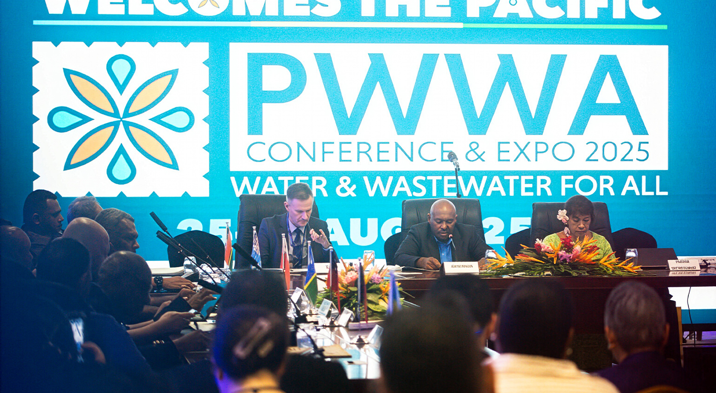
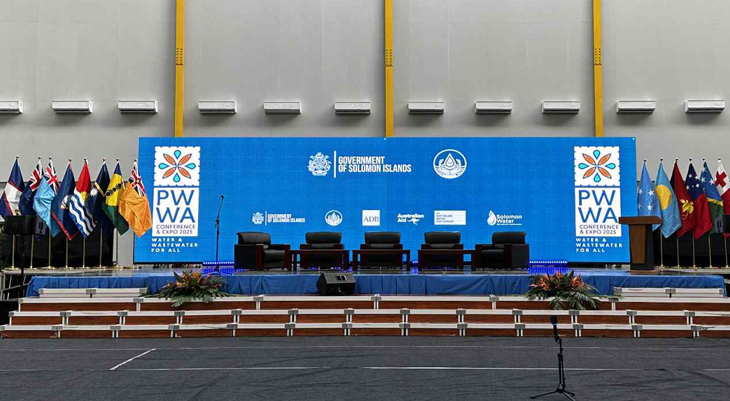
The Pacific Water and Wastewater Association Convention is a yearly conference to discuss solutions for water problems in the Pacific. The vision for this conference is not only to strengthen the Pacific network, but to help people be more aware and more conscious around saving water and have access to safe water for drinking and sanitation.
This conference is the one and only leading waste water association in the Pacific that not only invites ministers for water and waste water, utility managers and water management representatives, but also allows young graduates and merging engineers to mix and converse with decision makers, so it was important to create a Logo suite that projected a sense of confidence, trust and excitement through the use of font, patterns and colours.
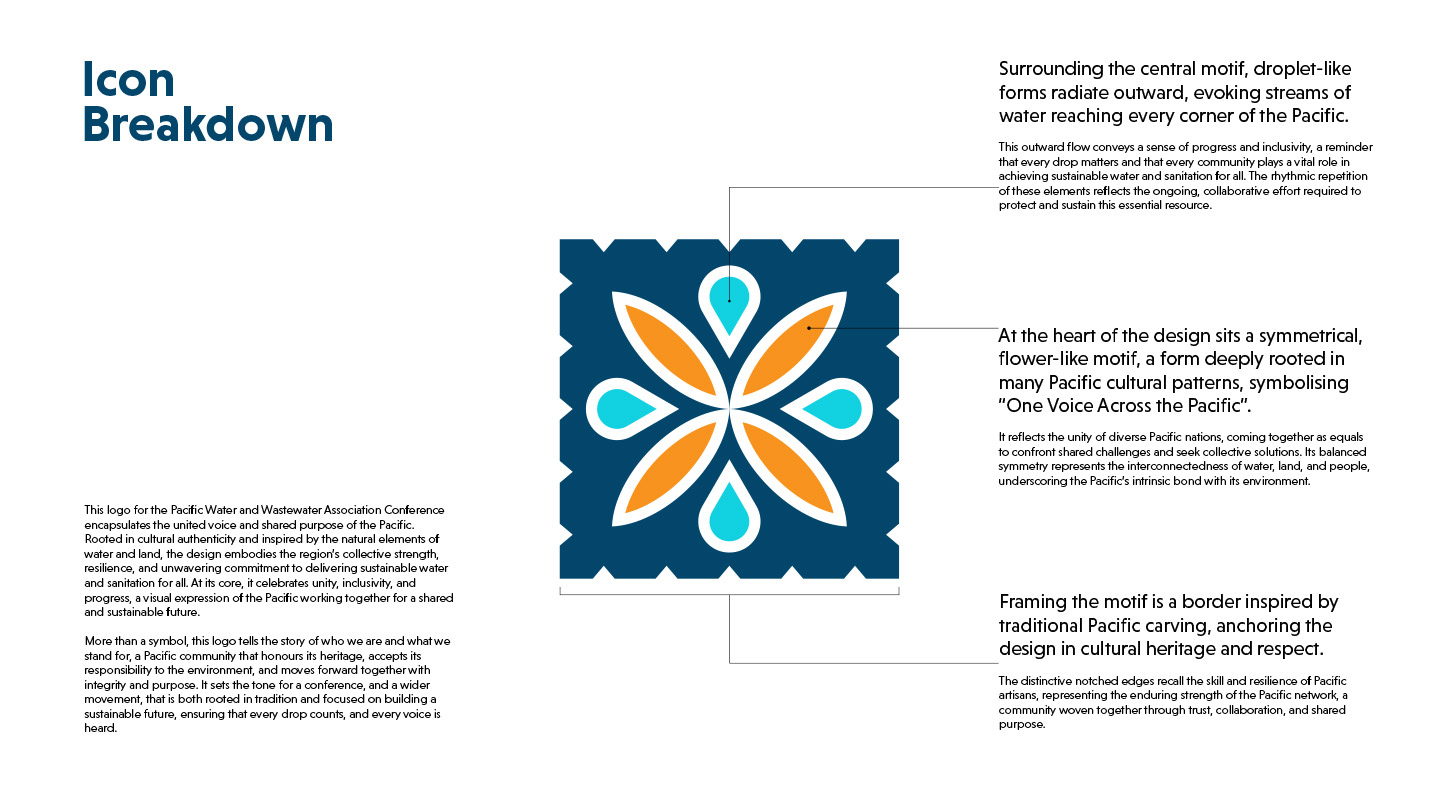
The logo created for the Pacific Water and Wastewater Association conference reflects the united voice and shared purpose of the Pacific inspired by the natural elements of water and land. The overall look of the logo embodies collective strength, resilience and commitment to sustainable water and sanitation for all.
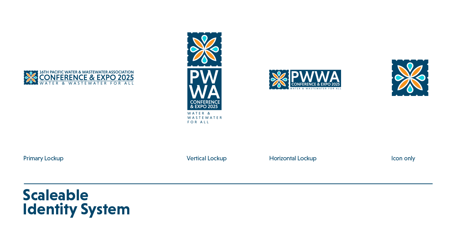
We believe the end results set the tone for the conference as it focused on the unity of Pacific nations coming together as a collective woven through trust, collaboration and shared purpose. Logo suite included the Primary brand logo, vertical lockup, horizontal lockup and icon lockup which was utilised throughout the conference and social media platforms.
Training Jersey
The mission for this project was to design a training jersey for the Sydney Roosters NRLW organisation celebrating the rich cultural identities of the women who wear it honouring their roots, ancestors, and the communities they represent.
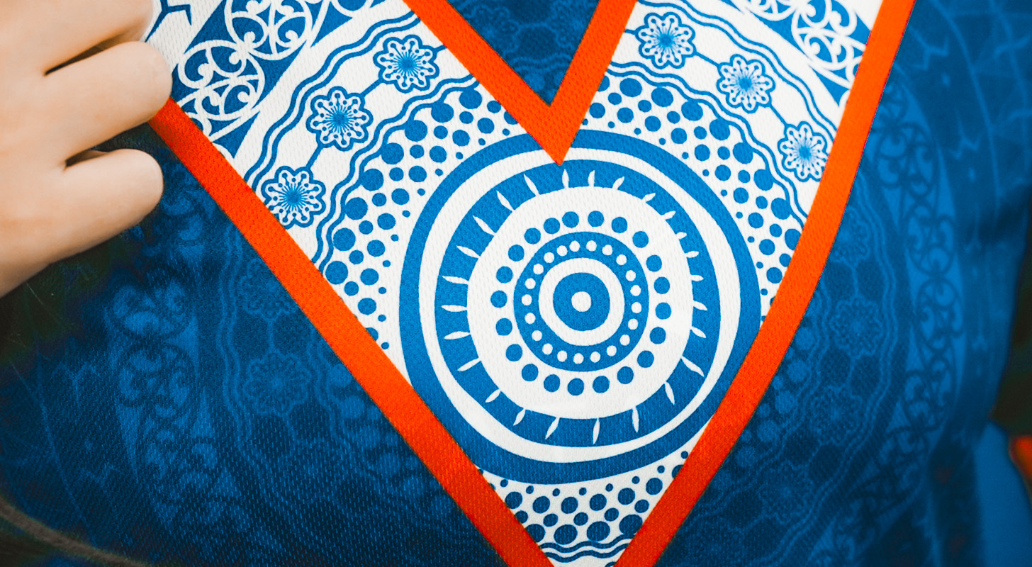
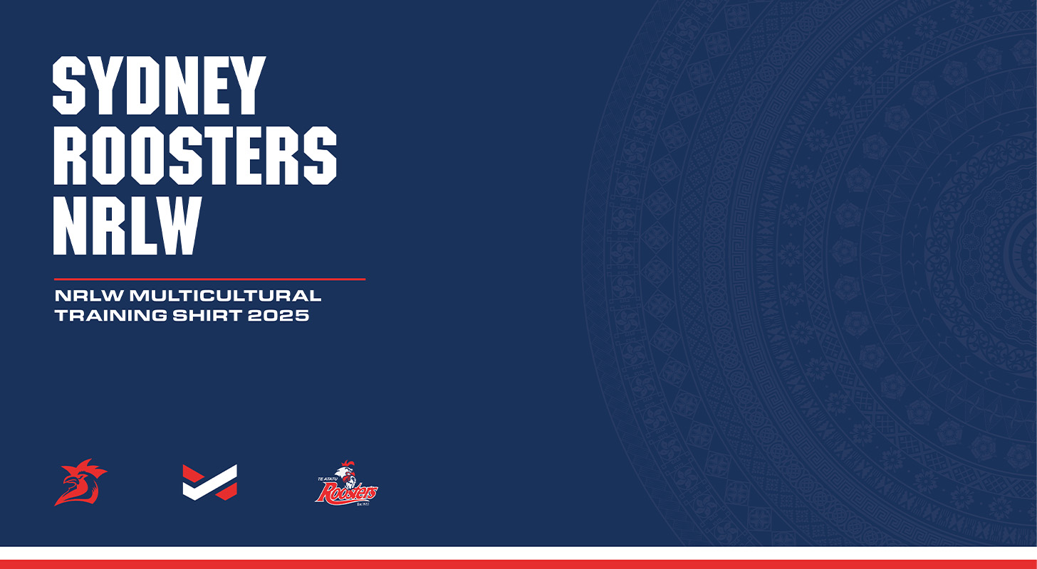
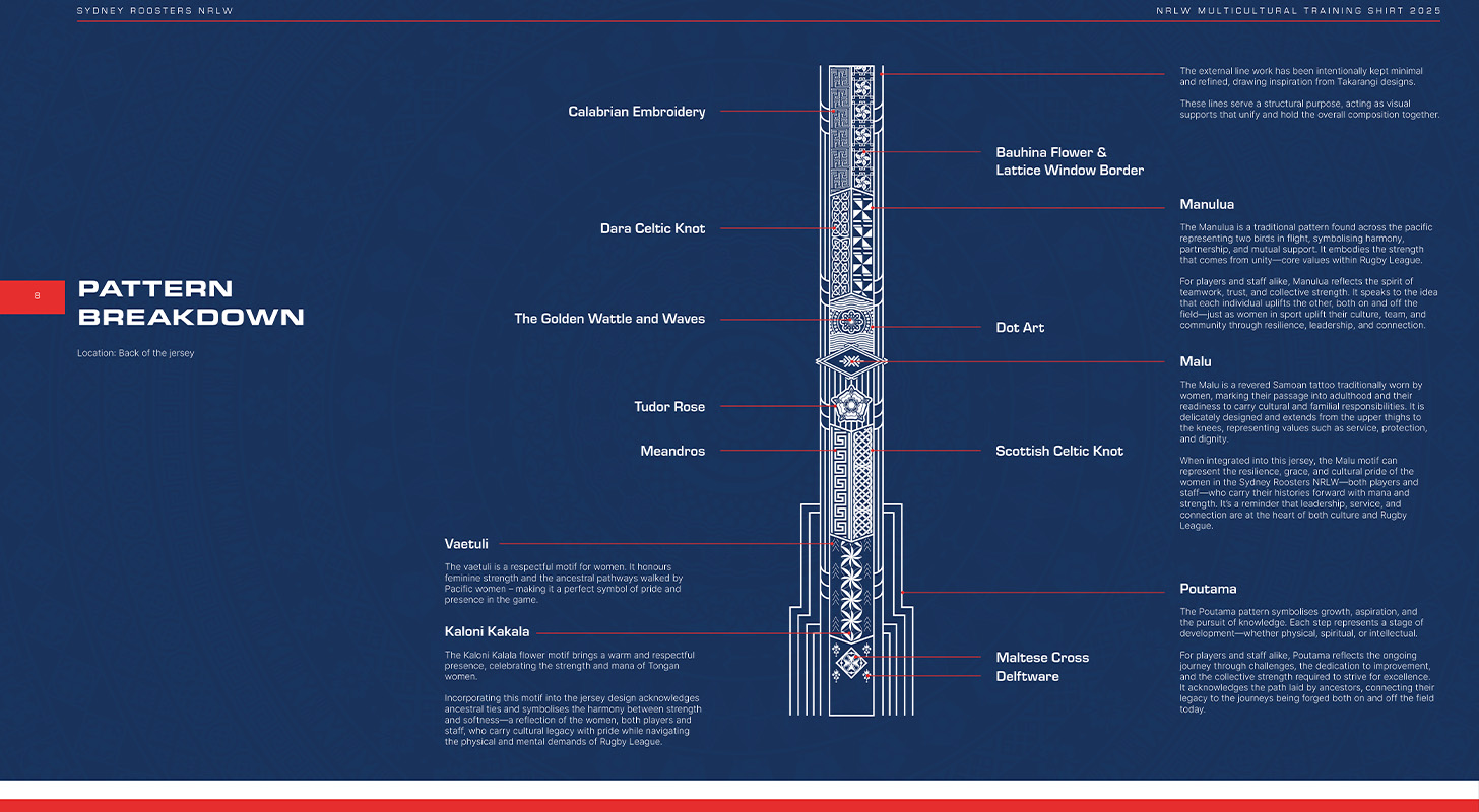
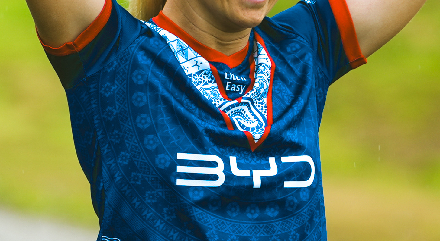
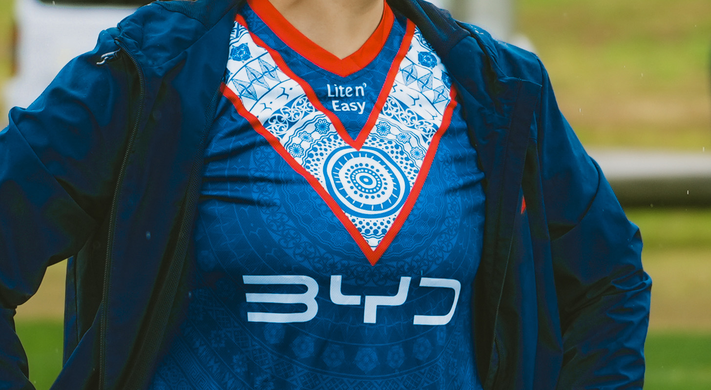
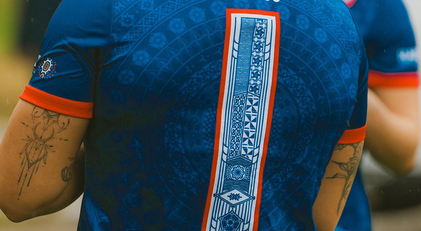
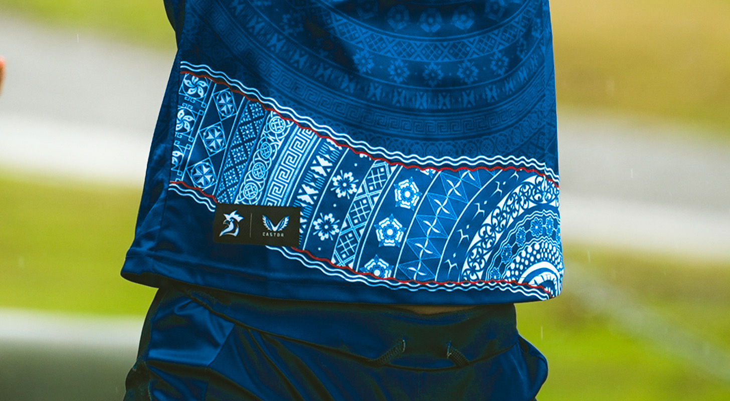
The Sydney Roosters Women are a rugby league team, representing the Eastern suburbs region of Sydney. The team is part of the Sydney Roosters club and plays in the National Rugby League Women’s Premiership. The design created was for the Multicultural Round.
The primary purpose of designing the training jersey was to celebrate women in league and promote women and girls into the sport. We wanted to design something that as a collective represented who the members are, where they come from and their cultural background celebrating diversity within the sport and team. This included Australia, Indigenous Australia, New Zealand, Tonga, Samoa, England, Poland, Fiji, Italy and Malta.

Using the main playing jersey as a layout template, the iconic ‘V’ strip at the centre of the chest serves as a focal point for the cultural designs. The design featured at the base of the jersey is an inverted colour way of the V-Strip pattern. Encircling this base design are flowing ocean waves, a tribute to the oceanic culture of Australia and the deep connection many of the communities share with the sea. The back of the design was inspired by the diverse cultures represented with the team symbolising unity, strength, and the collective backbone of the organisation.
Training Jersey
The mission for this project was to design a training jersey for the Sydney Roosters NRLW organisation celebrating the rich cultural identities of the women who wear it honouring their roots, ancestors, and the communities they represent.

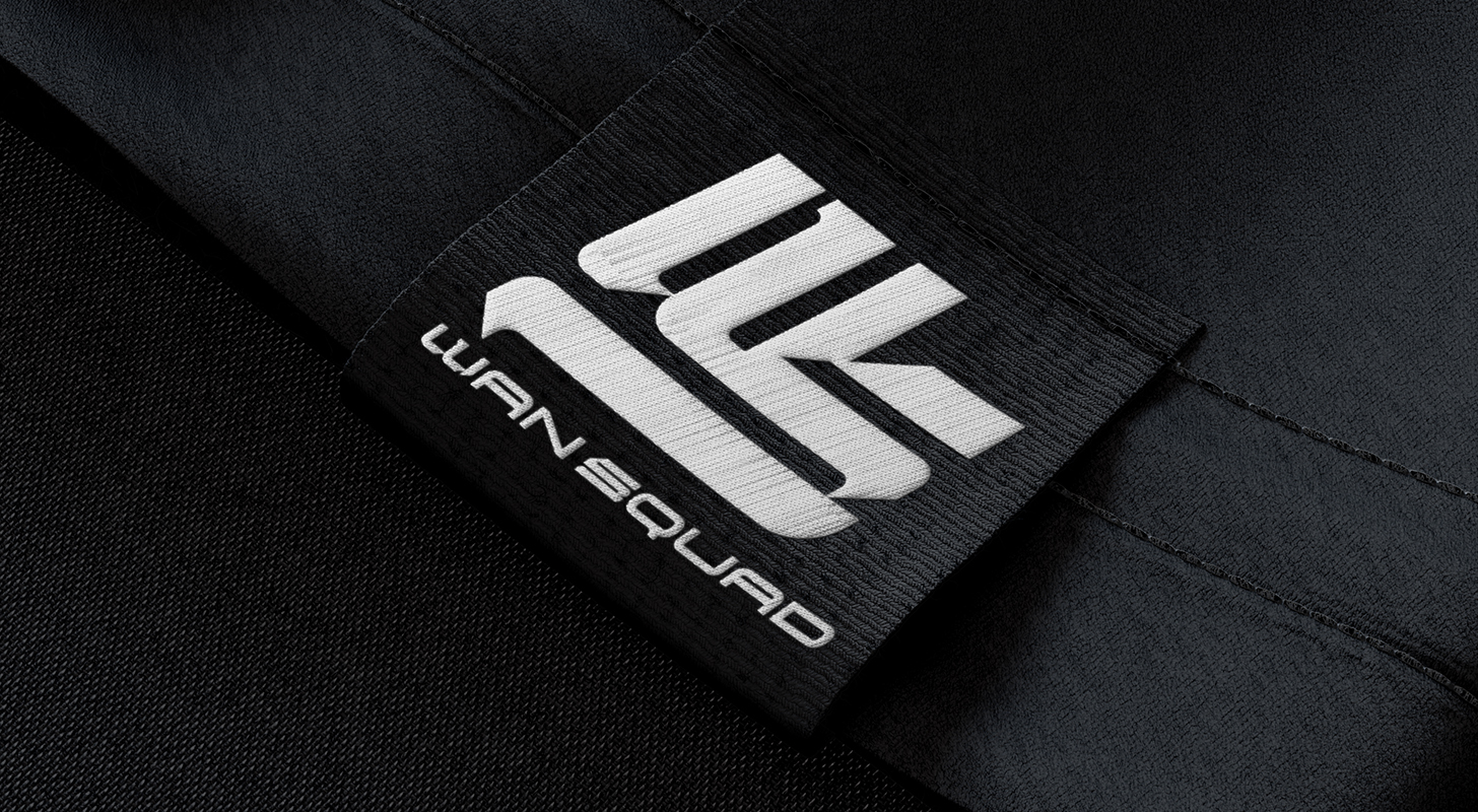
Wan Squad is a hip hop group from Papua New Guinea who won back to back gold medals at the world hip hop championships (2024 - 2025)

The rebranding included a new Logo and Merchandise design to reflect the purpose and passion of Wan Squad which includes providing platforms, events and competitions for local dance communities, health and fitness initiatives with their main focus on storytelling.

The logo created celebrates movement and the brands street origins. It draws inspiration from the references discussed in the discovery session such as edgy, fluid and clean but also reflect a sense of truth worthiness, inspiration and professional yet approachable, blending the bold character of street calligraphy with a refined, professional finish.
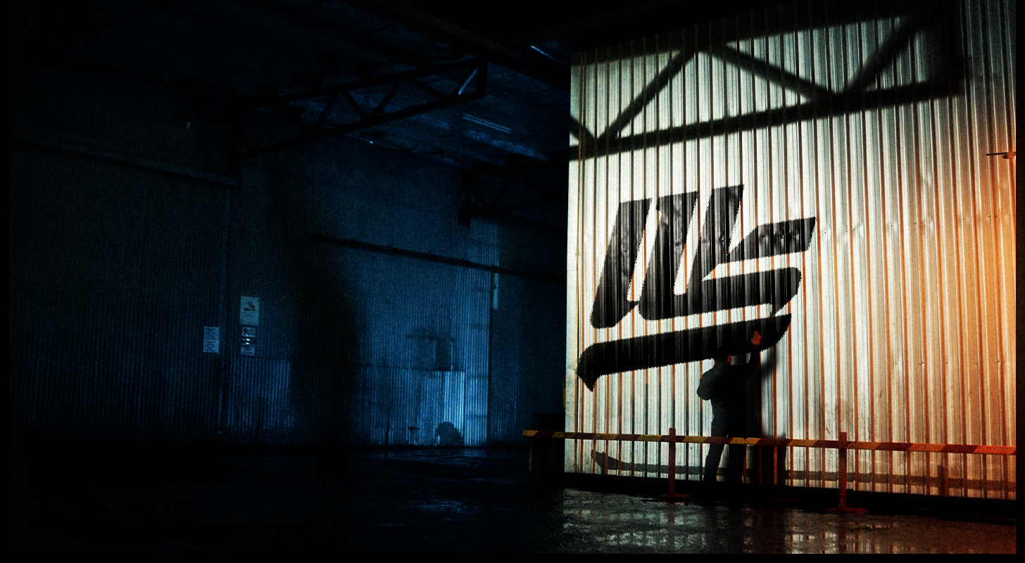
Each stroke on the WS monogram echos the motion of a wing with the W forming a subtle silhouette of an eagles head representing their spiritual fellowship, vision and journey.